If you made it through last week’s post you may still be wondering about the practical applications of having SmO2 data available to you as a coach or athlete. If you need a refresher on that blog or need to look at it for the first time, feel free to go back and take a few minutes to digest it: https://blog.xlr8-performancelab.com/post/smo2-why-you-need-to-understand-it-and-then-use-it That info will be valuable for the practical applications and implications we will take a look at today.
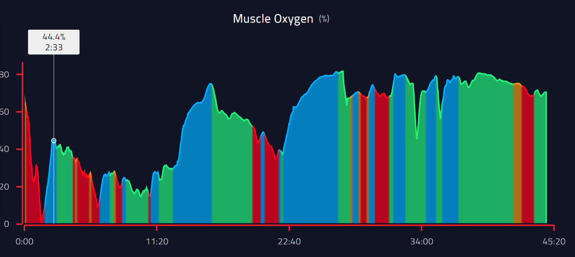
Last week I presented a chart of an elite level high school girl taking a threshold test. She ran a fantastic test and it gave us a great threshold value with which to base our work. Or did it? Let’s take a look at her threshold test workout (Figure A) followed by her actual threshold workout (Figure B), based on that test, nine days later.
Figure A:
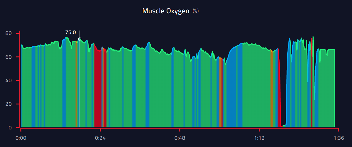
Figure B:
Woah.
Let’s examine further what was “supposed” to happen vs. what actually happened. This workout was supposed to be 20 minutes at a pace slightly slower than her identified threshold pace. I did not see her watch, so she was the only one with access to see the color zones and percentages while she was doing the workout. She warmed up between the start and until around the 15:00 mark (the end of the first larger blue section). She quickly fell off pace and was visibly struggling. We stopped around halfway and took several minutes to regroup. She finished the second half at a slower pace but was still struggling to stay out of the red (anaerobic work). She averaged nearly 40 seconds per mile pace slower than we anticipated based on her test. So what the heck happened???
Let’s take a look at the obvious. Her warm-up tells us all we need to know. Her body was not in a good place to do a hard workout that day. The workout was run in the morning as opposed to the test which was done in the evening. Additionally, it was nearly 10 degrees warmer on the day of the workout. Her blood oxygen plummets at the start of the workout to one of the lowest levels I have seen on her data. It bounces up and down as she continues through her warm-up, but never truly settles in. It goes up near the start of the workout mainly due to her standing and preparing to start. Compare the warm-up of that workout now with the warm-up of the test in Figure A. The test warm-up is nearly flawless. Her oxygen levels are steady and remain at a high level throughout.
Looking at these two graphics that should look fairly similar it would be hard to convince anyone this is the same athlete! But, the data does not lie. The SmO2 data was able to tell us that she should never have done that workout on that day. She admitted after the fact that as she started warming up she felt miserable and was worried the workout would go badly. As it turns out, she was very in tune with her body and we should have saved that effort for another day. Moving forward she will now be monitoring that data on her watch before she starts a workout. If her warm-up is way out of wack we will know we need to adjust our plans or abandon them altogether for some rest and recovery.
The implications of this data are far-reaching. The ability for a coach or athlete to know on the spot whether or not they should continue with the given workout for the day is the individuality we all proclaim to be seeking. You can choose to continue on with your current data measures, or you can start learning about SmO2 and beginning the process of optimizing your training.
If you want more information about SmO2 or have other general training questions, feel free to reach out via the email link. Looking forward to next week’s blog on the power of progression and what takes a 5:01 middle school miler to a 4:09 high school senior. Subscribe to our email list so you never miss out on a new blog!
Ben